
To make a long story short, the awesome John Gall of Abrams Books approached me in early 2015 about doing a collection of my work. To say I was excited would be an unbelievable understatement as I’ve always viewed these types of books as milestones in an artist’s career. We discussed it being kind of monograph in style, and kind of journal in style. John explained to me how he thought it was a waste to have artists wait until they retired to publish a collection of their work. He went on to explain how publishing volumes throughout time felt like a much better way to handle this type of material, and of course I agreed.
It took us a while to figure out a direction though. I didn’t want it to come across as a how-to book which a lot of contemporaries were doing, and I also didn’t want it to be just a boring old picture book. There had been many of my favorite artists who released collections of their work, but it was basically just a glorified portfolio, and something about that felt too cheap to me.
We finally decided on putting together a collection of work based on my influences and feelings towards how I approach the work and lifestyle of a designer. Each chapter begins with an essay introducing a specific topic and then a bunch of work follows that helps connect the inspiration to the work.
Collecting the work was hard, organizing it was brutal, and laying it out was fun but extremely time-consuming. It’s definitely something I enjoyed doing though, so it’s not like it was so bad that I’ll vow to never make another book.
Originally I wanted to call the book “March on to Victory” after a song by Zombie Apocalypse because the lyrics always got me fired up every time I listened to it. After almost a year of back and forth on titles, we agreed on “Brand by Hand” to try and make it a little more market-friendly and easier for people not familiar with my work to understand the content of the book. I did get to use an excerpt of the lyrics to the song on the end pages of the book though, so I’m happy about that.
Designing the cover was my own personal living hell though. I thought branding myself was hard? Doing a book cover for a collection of my work was basically a nightmare. I kept thinking, “This could be the only time I do something like this and anyone might care, so this has to be the greatest, most iconic thing I could ever do.” Always a healthy mindset to be in, no pressure. So I figured if I had to wiggle on the title a little bit, then I’d go hard on the imagery. I had a few months to get the cover finished, so I felt like that was plenty of time to explore some really cool concepts. In the back of my mind, I kept thinking this was gonna be one of those down-to-the-wire decisions though.
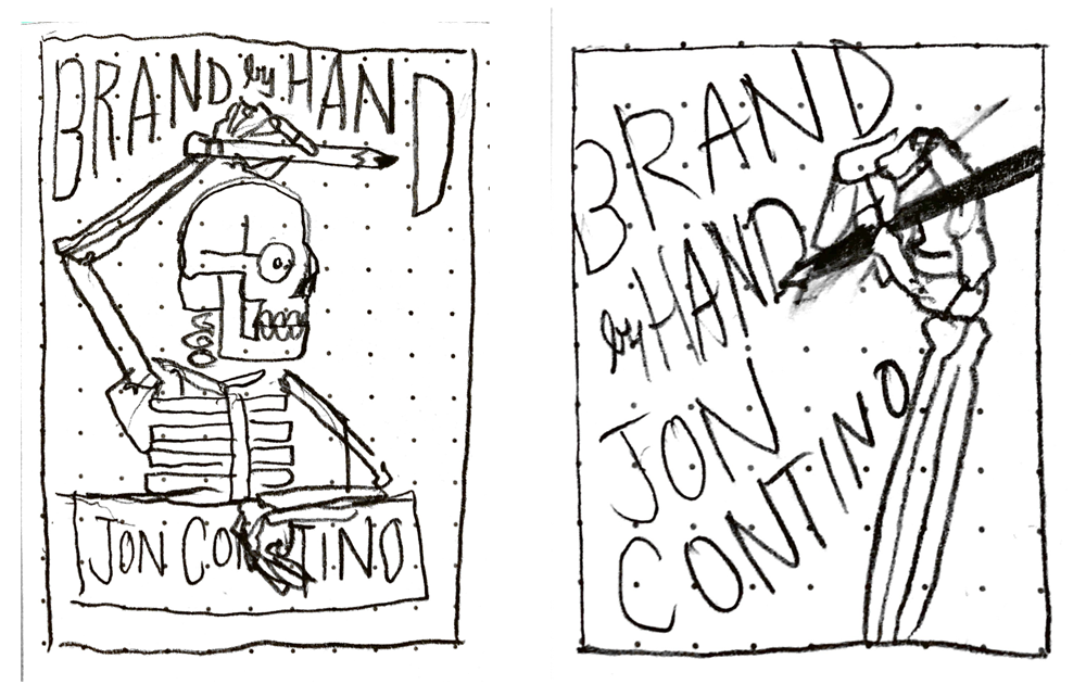
I started with some skeleton shit (obviously) and liked how the first sketches started coming together:
Then I inked with some temporary color to show the difference between possible layers:
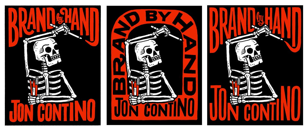
My initial reaction was, “Cool this is fun.” Sent it out to the publisher and they liked it. Then I sat on it for less than a day and had two major problems with it. I had to include a subtitle and the negative space was not really conducive to that. More importantly, the skeleton had no fuckin emotion whatsoever. Not that skeletons can really show emotion I guess…but still—totally not me. Not representative at all of who I am or how I work. So then I immediately went into a downward spiral of depression and self-deprecation for at least a week.
I was determined to make this work. There were also some caveats I was up against:
- I did not want the cover to be some super-lettering-centric design. I did not want to get lumped into the “lettering” class of books. I find the majority of them extremely dull, the latest ones from newer artists are downright vapid, and I’ve always thought that what I do goes beyond lettering anyway. Hence the title!
- Although my gut reaction was to do something with a hand, I did not want to just copy something I did almost 10 years ago. I thought it would be too expected. So if I wasn’t going to use a hand to tie back in with the title, then I needed to show utensils being used somehow.
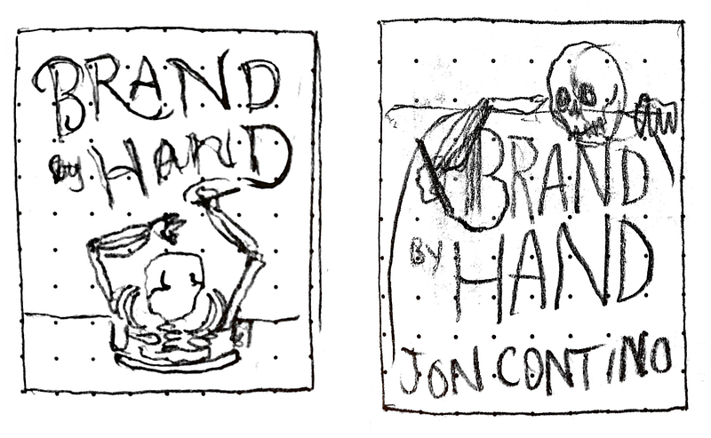
I started trying new ways to make the skeleton work with more intensity to make the cover feel more alive, but what I ended up with was awkward poses and shapes that just didn’t feel right.
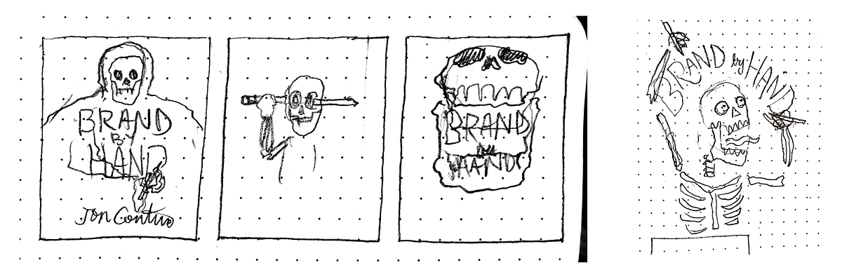
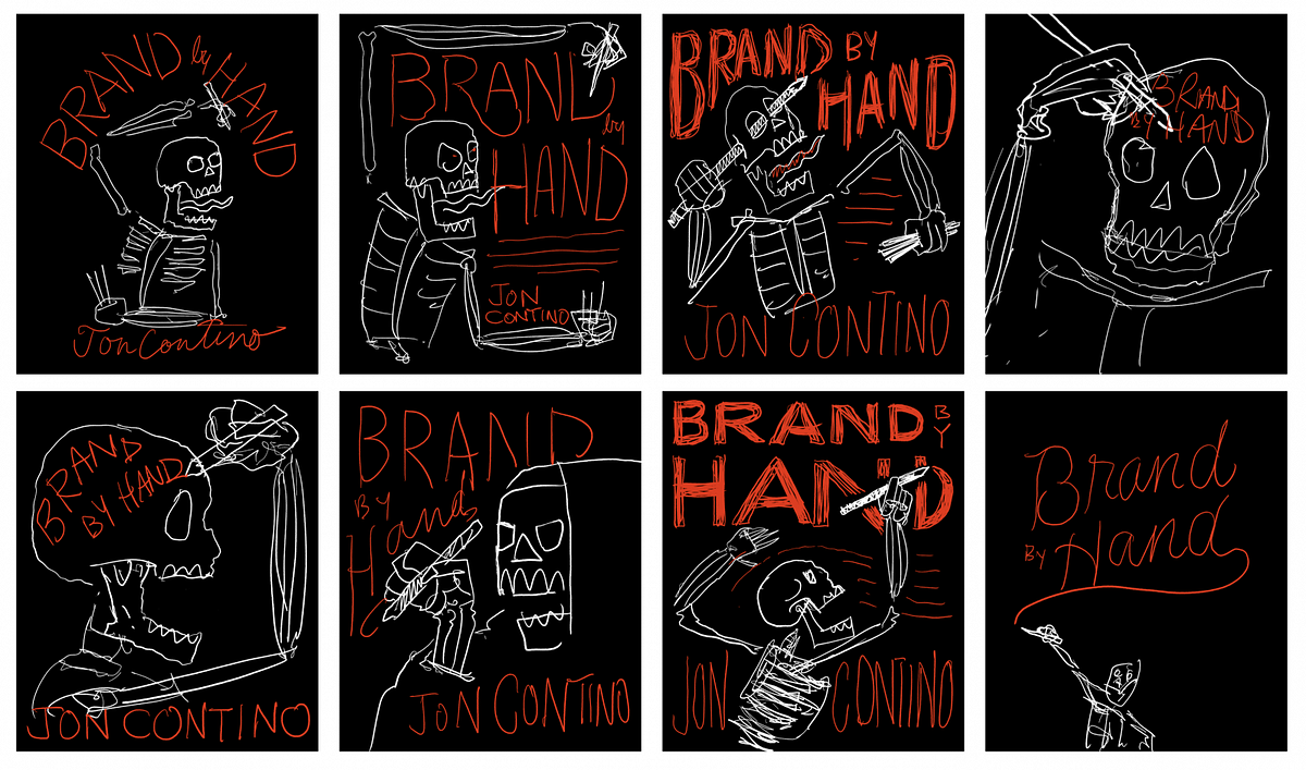
Sketch after sketch, my brain started shutting doors and windows to any sense of accomplishment and I began to feel trapped. I gave myself two months to work on this cover to make sure it was something I absolutely loved, and here I was, literally in the 11th hour before the deadline, and I had nothing to show for it. So I kept pushing…and things got worse.
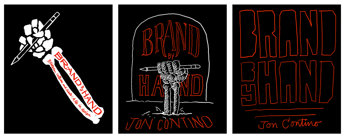
At this point I only had a few hours left until the morning deadline and I had all but given up hope of doing something halfway decent. This was rock bottom, the place I knew I’d hit eventually. I sat in my kitchen, head in hands, feeling like a gigantic failure. Finally I got to the breaking point where I couldn’t stand the pressure I was putting on myself anymore. I threw my pencil down and let out a loud “fuck it.”
To me, this is the turning point. It’s ALWAYS the turning point. This is what I do to myself on what seems like every single project. I kill myself trying to be creative the entire span on the project and then get to the last few hours only to find my back up against the wall with no time to explore or experiment. I just have to “do.”
I gave up my stupid issues with the hand and tried to figure out a way to utilize it in a way that didn’t make me feel like a hack. I KNEW this was going to happen to me. I knew I was going to torture myself for weeks until I had no time left and then I’d do something stupid I should’ve done at the beginning and it would start to click.
So I traced my hand like a child and tried to do something with it.
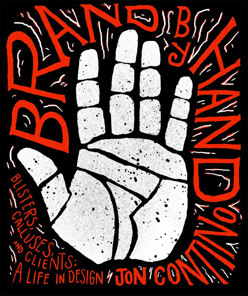
This one felt more cohesive, more iconic, and fit all the information into the negative space in an interesting way. I felt like it was kind of a combination of something A Tribe Called Quest might do and the Converge “Jane Doe” album, so that made me feel really good too.
Since this was rough I spent some time cleaning it up, did an alternate version, and showed it to John to get his honest opinion. He liked it and wanted to include the skeleton with the concepts so we could show the range of ideas to the rest of the team to get outside of our bubble and see what people think about the whole thing.
These were my final three cover concepts:
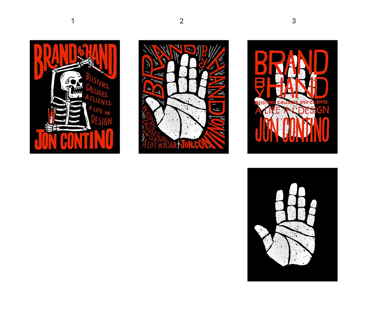
Just to explain real quick:
- I moved the skeleton’s posture a bit so he a little more movement. I made him a little more aggressive and I added the subtitle in. I still hate that negative space on the left, but if for some reason everyone thinks this is the best one, I’ll figure out what to put there.
- The hand got redrawn a bit, the lettering was treated to some love, and I made sure the white lines didn’t distract as much.
- The last version is a little more experiential. The idea here would be that the hand sits alone on a black book cover, but then we would use a clear dust jacket to print the title on.
I fell in love with the hand at the end. It felt gritty, raw, and fucked up. It looks like it went through hell and that’s all I ever wanted for the cover. I wanted a sense of torture and perseverance, but I wanted it to be super simple, iconic, and to stand out on a bookshelf or thumbnail on Amazon.
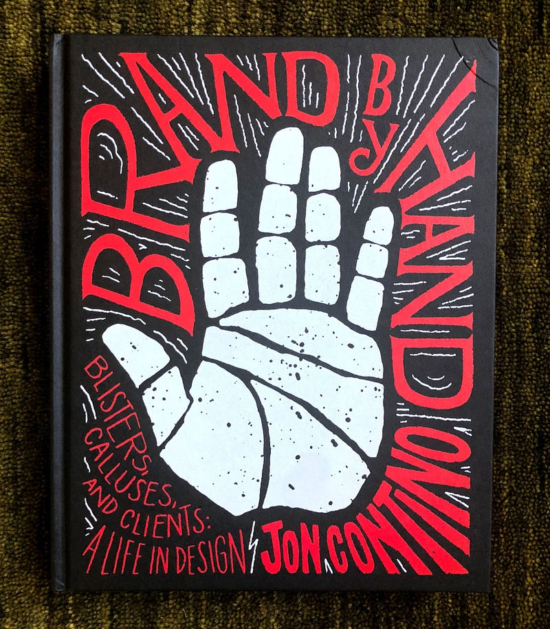
As for the rest of the book, I feel like it came out better than I could’ve ever imagined. The pages are all black with painted black edges and the paper feels soooo good to the touch. John and the team at Abrams did an amazing job bringing this whole thing to reality and absolutely killed it with the production in all aspects. I couldn’t be happier with the final product.
If you want to pick one up or see some of the content inside the book, go to continobook.com, or you can go straight to Amazon to pick one up!


